
First I created a background using the rectangle tool and gradient tool.

Then I inserted my logo and some graphics while moving the background aside.

I then added the text.

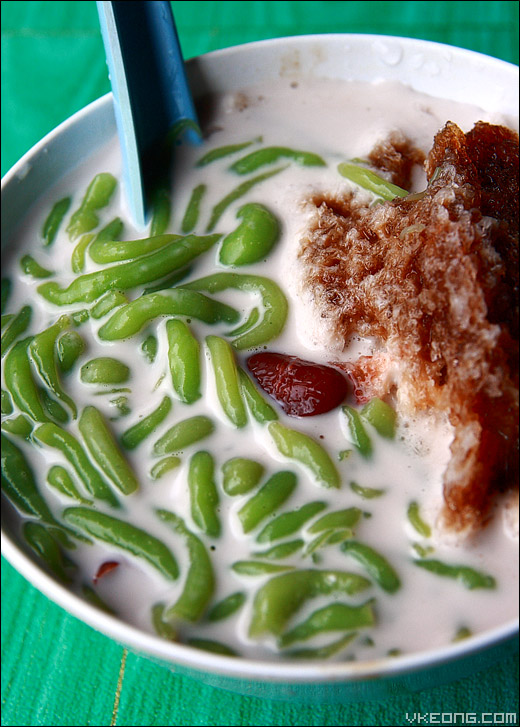
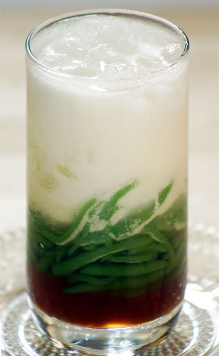
Next I designed the drink itself using these 3 different graphics.

This is the product of the 3 graphics.

Then I put it all together and adjusted everything accordingly.

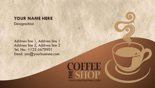
And this is the final product.
References
Stain Solver, (n.d.). Chocolate syrup. Retrieved April 11, 2013 from http://www.stainsolver.com/artman/uploads/1/ChocolateSyrup.jpg
Vkeong, (n.d.). Cendol. Retrieved April 11, 2013 from http://farm4.static.flickr.com/3532/4077633311_d3daa8032d_o.jpg
Suraya Sulatin, (2010). Choco top. Retrieved April 11, 2013 from https://blogger.googleusercontent.com/img/b/R29vZ2xl/AVvXsEigi4dv7JEQbRjtNK07pFXvNtjARzjUhBt7Ex_ri9q4Lh53I_AVlHpBxs0B8wfa3LwjFizDxnctr_dzeQEi2Ycz0UVstITpUdJPs9_1P30oqFkPNnmfrY4jSWaSEmvChCUCRHBI5Hk-ALgs/s400/choc_top_wa.jpg
Indosandi, (2008). Cendol. Retrieved 11 April, 2013 from http://ketela.files.wordpress.com/2008/06/cendol.jpg
Coffee Machines UK, (2013). Coffee beans. Retrieved 11 April, 2013 from http://coffeemachinesuk.org.uk/wp-content/uploads/2011/04/coffee-beans.jpg


